
Do you ever have an image in your head--maybe not an image, but an idea or a feeling-- of how you wanted something to look?
And in your head it was perfect, but when your hands got involved... meh.
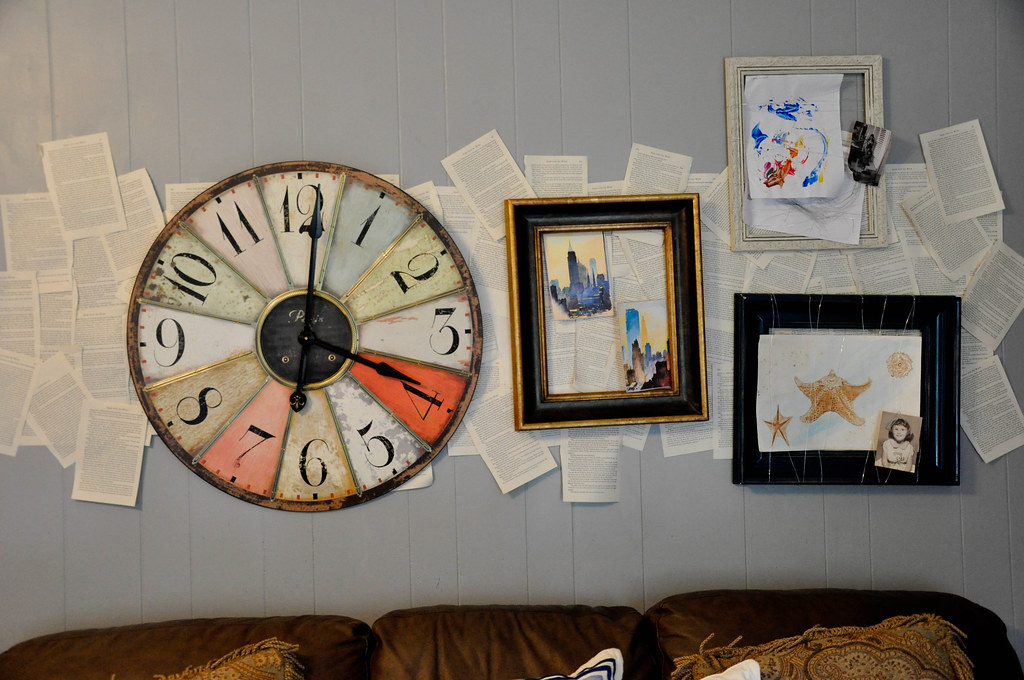
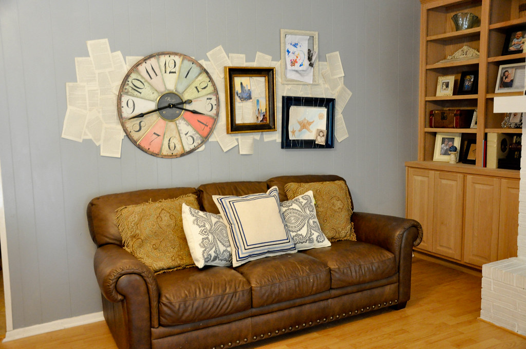
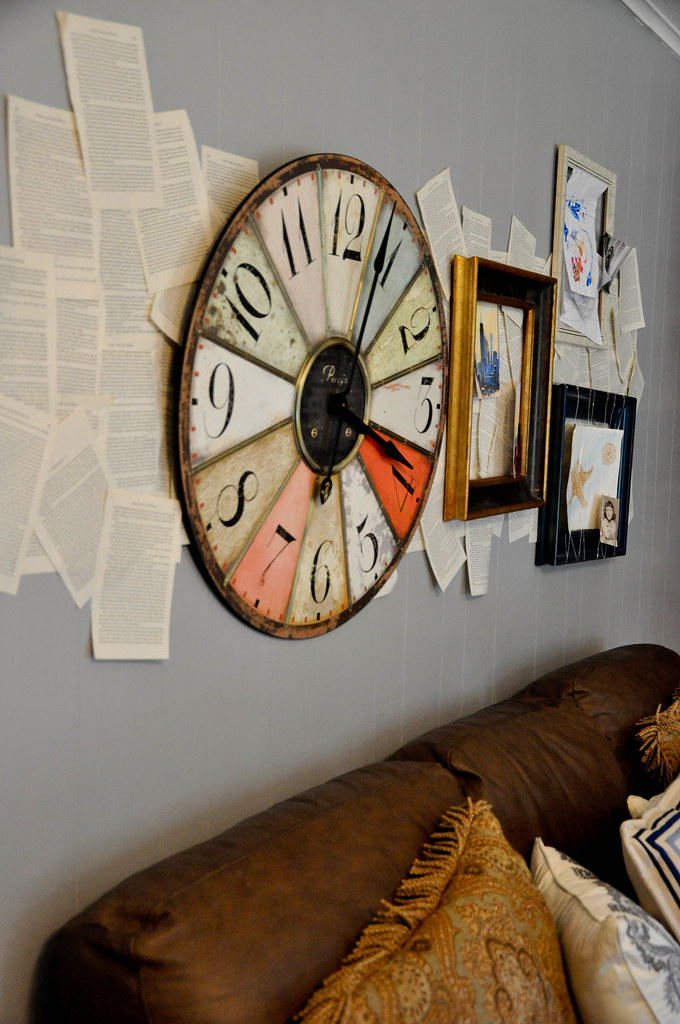
That's where this space over the couch is living right now.
I just don't know, and since I'm working with a place in my home that is highly visible, I want to KNOW that I love it.
Normally I am very structured, a stay-in-the-lines, symmetry-is-good, everything-in-its-place kind of girl.
So the imbalanced "messiness" makes me a little nervous because it feels risky for me.
What I do like:
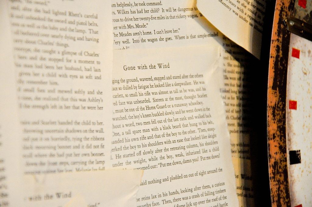
1. It's very personal for us. The book pages are from one of my favorites, Gone with the Wind.
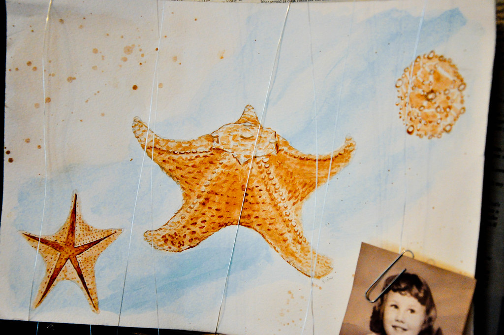
2. I painted the starfish watercolor when I was in college and that is a picture of my mama as a tot. The frame is actually navy (tricky lighting) and is the same color as the end tables I wrote about here.
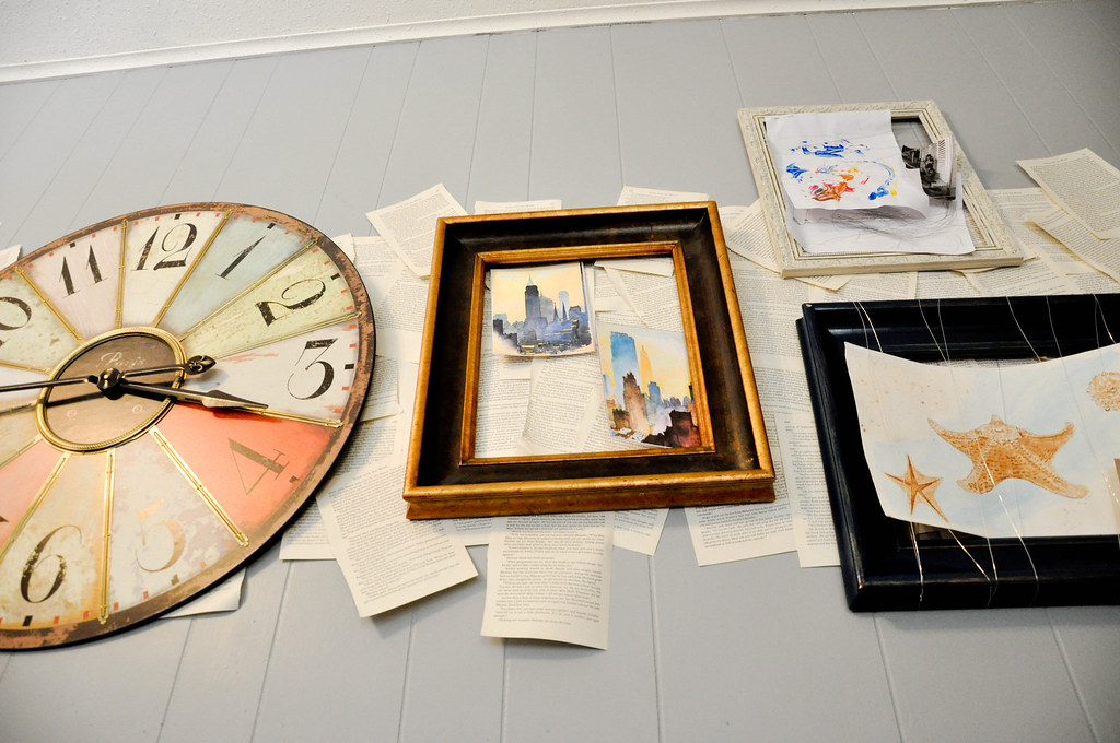
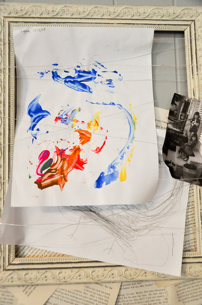
3. I used some of the kid art I'd been saving and I really like how I displayed it on top of the wire-wrapped frames.
4. The big clock makes me happy, too.
So.... feedback?
Any designers, decorators, inspired homemakers or healthy criticizers out there?
Don't be too hard on me.
Afterall, it's up there and I may not ration the energy to climb on top of the couch and pull it all down again for another six months.

It's very interesting & unique, I like the idea of it. I think it might be the frames throwing things off - the lighter & the darker ones mixed. I think the darker ones work because of the contrast and the dark leather furniture. I'd paint the light frame black or gold. Also, it seems like you could use two smaller ones on the left side - maybe 4x6 size even? I love that clock, I almost bought it myself but it wouldn't fit in the places I wanted it for. Also, I think you have to be careful here - the scattered paper, soft blue wall color, the style of clock and the starfish art (which is wonderful, BTW!) makes me think "beachy" and the rest of your room doesn't look conducive to that. That's just what I think --- I find I need to leave something for a while and it grows on me or I find a solution when I least expect it.
ReplyDeleteI agree about the frames... that white one wasn't working for me either and i do think adding a few more would help. I am trying not to be too themey (like beachy) but I do have a lot of weathered and worn items in the room for accessories. Thanks for the feedback. Good thoughts.
ReplyDeleteI like it, and think it looks great... I think it would be even better if you made the lighter frame go dark. I would also try to pull down a few of the book pages, it looks "dense" to me. (I don't know any other way to describe it - sorry!)
ReplyDeleteDefinitely scrap the white frame...and add some smaller things to be thrown around in between stuff if that makes any sense, to give some texture. I love the asymmetry of it all though.
ReplyDeleteHmm. Let me start by saying that I love ALL of the elements, separately. The wire frames are fun, the book pages are fun, your starfish are lovely, and the clock is fantastic. But... I think I would go very structured on top of the wild pages- like a straight line of navy frames with bright artwork/photos inside (bring in the room's colors, or the colors from the clock if you reuse it in this room). And I would move the clock to another wall/space. And hang the cool wire frames/collages together on another wall/space. BUT that's just me! Kudos for all of the amazing ideas! I've never seen anything like, well, any of it! Great pillows, by the way.
ReplyDeletevery good ideas... i'm taking them all to heart and turning them around in my head... i knew i wasn't quite in love with it all.
ReplyDelete