I made a Facebook pinky-swear to post about the bathroom re-do today and I never break a pinky swear.
Our newest adventure is the guest bathroom. Here are the before pictures so you, too, can marvel at how its 1984 glory days had been living on for decades.
Our newest adventure is the guest bathroom. Here are the before pictures so you, too, can marvel at how its 1984 glory days had been living on for decades.
strange chainy light fixtures (I won't tell you exactly where I held them when a few girlfriends were over, but it involved pretend anatomy and got me a good laugh--just like 7th grade),
faux mint green marbled countertops,
peeling wallpaper (complete with a sad, sad trim) and bad laminate flooring,
awkward (and cheap) cabinet and an awfully small potty with a soft, cushy seat that spoke to whomever sat on it, "pffshhhhhhh," as it flattened underneath the weight.
Aside from cosmetic issues that I so lovingly addressed above, the space had quite a few functional issues.
1. The size and shape. It is a square bathroom with enough floor space but not a lot of surface, storage or wall space.
2. No windows = no natural light. The bathroom was very dark with only a vanity fixture for lighting. This also made choosing a paint color tricky.
3. Awkward, small toilet that felt like it was in the middle of the room, very exposed.
4. No vent
5. Small bathtub/shower
6. Narrow mirrors that left the room feeling like even more of a cave
7. Shallow sink with low faucet

Our Solutions:
1. Floors. The old vinyl was ripped up and replaced with a grayish 18" ceramic tile and gray grout, then new baseboards were added. I want to point out that this was really old laminate flooring and solid glue held it in place. We pulled up as much as we could, but the bits and parts that wouldn't budge were tiled right over. It saved a lot of time--and elbow grease-- and was recommended by the professionals we spoke with.
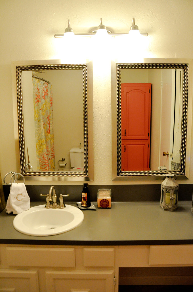
2. Lighting. My images aren't stellar, but the fixture is here if you're interested. I'll also note that I got it for a half-price deal for only $26.10 and free shipping. Win! It adds so much more light, but the room really did need a centered overhead light too. Because we also wanted to install a vent, we went with a combo light/vent and it's functional--not the coolest (just a standard flushmount).
3. Countertop. Though we did install granite in the kitchen, that was not in the budget for the bathrooms and I really deliberated on this decision. Should we install a different, more attractive, laminate? What about tiling it? Or, should we do nothing and save up for a solid surface? In the end, we saved our cash and painted it with a paint made specifically for laminate countertops, made by Rustoleum. It took two coats-- was VERY strong smelling-- but worked great! The paint was only about $20 and made one of the grandest impacts in the room. I recommend it.
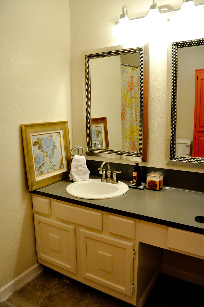
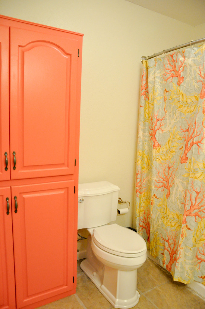
4. Cabinets. The vanity cabinet stayed and got a coat of glossy white. The too-narrow corner cabinet (with warping doors and a mildew smell) was pulled out and replaced by a Craigslist find that I sanded and painted with Valspar Firecracker. More on that later.
5. Walls. Oh, the wretched wallpaper. I know it's very chic right now, but I will NEVER install wallpaper in a house. Jeremy proved his undying love a million times over by removing most of it and then retexturing the walls where drywall was ripped. And he never even said a bad word. The man is the Ghandi of home renovating.
The paint color I chose is called Bistro White (also Valspar). I wanted to go very neutral to balance the bright curtain and bold cabinet. Also, the room is windowless and needed to maintain a bright, airy element.
6. Potty. Replaced. Good solid seat. The end.
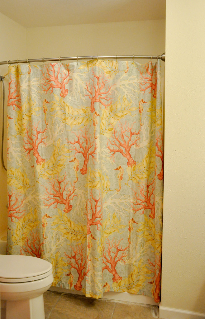
7. Details. We went with two pewter mirrors, a prettier faucet, a new toilet paper holder and a curtain rod that bows out to give a bigger feel to the smallish tub. I also splurged on the Pottery Barn curtain that adds color and punch, but still blends in with the softer blues and overall palette of our home.
As is always the case with me, I haven't decided on a few accessories for the walls.
It's so much better now. Best of all, we really did pay very little for the dramatic difference between before and after.

Shared with: Miss Mustard Seed, Sugar Bee Crafts, A Bowl Full of Lemons, Tatertots and Jello


No comments:
Post a Comment
Note: Only a member of this blog may post a comment.